
It’s been several years since a colleague shared an intriguing paper with me: "Calling Dunbar's Numbers" by MacCarron, Kaski, and Dunbar. It was/is an intriguing paper with interesting claims. Having previously worked in telecom data analysis, I was immediately drawn to their approach of using mobile phone call data to investigate Dunbar's social layers theory. But as I read through their methodology and findings, something didn't quite add up. I’ve sat on this niggling feeling but finally I decided to do some analysis and write my thoughts up.
Could the patterns they found be an artifact of their analytical methods rather than evidence of actual social structure? This question led me down a rabbit hole of investigation that ultimately revealed something surprising: the apparent structure of social layers might simply be a mathematical consequence of applying clustering algorithms to noisy skewed distributions.
What is Dunbar's Number?
For those unfamiliar, Dunbar's number refers to the purported cognitive limit on the number of stable social relationships a person can maintain. Robin Dunbar, an anthropologist and evolutionary psychologist, proposed that humans can only maintain about 150 meaningful relationships due to the limitations of our brain's neocortex.
Beyond this overall number, Dunbar's theory proposes that our social networks are organized in concentric circles or "layers" of roughly 5, 15, 50, and 150 individuals. Each layer represents relationships of decreasing emotional closeness:
5: Closest relationships (immediate family, best friends)
15: Close friends and relatives
50: Good friends and extended family
150: All meaningful relationships
This theory has been widely cited and has permeated popular understanding of social structures. It's appealing because it offers a simple, neurologically-based explanation for complex social behavior.
The Paper: "Calling Dunbar's Numbers"
MacCarron, Kaski, and Dunbar analyzed a dataset of mobile phone calls from 2007, containing records from over 6 million users. To focus on personal (not business) relationships, they filtered the data to include only reciprocal calls and users who had between 100 and 500 contacts.
They applied various clustering algorithms to the call frequency data and found that most users' call patterns could be divided into 4-5 clusters. The sizes of these clusters aligned remarkably well with Dunbar's proposed layers:
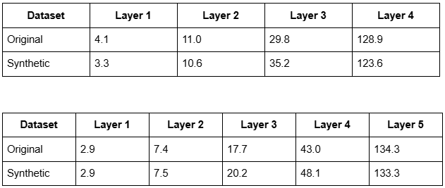
For 4 clusters: cumulative layers of 4.1, 11.0, 29.8, and 128.9 people
For 5 clusters: cumulative layers of 2.9, 7.4, 17.7, 43.0, and 134.3 people
This appeared to provide compelling evidence for Dunbar's theory using real-world behavioral data. The structure seemed to emerge naturally from how people allocated their communication time.
My Skepticism
While the results seemed impressive, I had a nagging suspicion triggered by a few factors. First, my (perhaps naive) prior belief would be that humans are way too varied and messy for their behaviour to be captured in a theory as neat and prescriptive as Dunbar’s layers
Second, clustering methods are designed to find divisions in data, but the original paper's own results raised questions. Looking closely at their Figures 3 and 4, the 'layers' found in call pattern data didn't fall into neat categories.
Finally, the number of 'layers' found varied widely (from 2 to 20), with only 27% of users matching the 4 layers predicted by Dunbar's theory. Even among those with 4 layers, the size of each layer varied considerably.
This suggests the data—individual call patterns — is noisy and continuous, without clear natural breaks. Fitting these noisy individual patterns means they weren't finding a consistent, population-wide behaviour— the hallmark of a predictive and general theory.
I wondered: Could a simple model without any inherent "layers" produce similar results when analyzed with the same methods?
To test this, I created synthetic data that mimicked call patterns but deliberately contained no predefined layered structure. If the same layered pattern emerged from this artificial data, it would suggest that the findings might be an artifact of the analytical method rather than evidence of actual social layers.
The Experiment
My approach was to carefully replicate the entire data workflow of the original paper, from network size distribution through call patterns to final clustering. The experiment proceeded in two main steps:
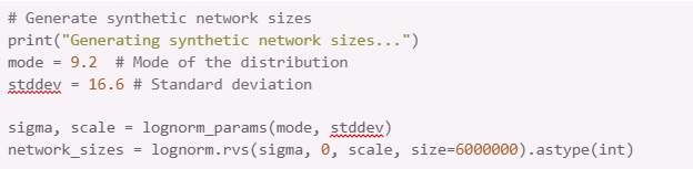
Step 1: Modeling the Network Size Distribution
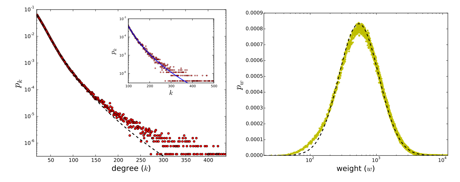
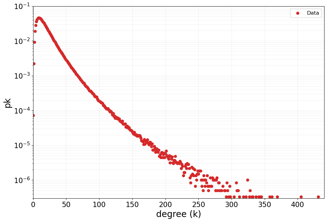
First, I needed to reproduce the distribution of network sizes (number of contacts per user) found in the original paper. Looking at their Figure 1, I observed that the degree distribution followed a log-normal pattern.
I generated a synthetic population of users with network sizes drawn from a log-normal distribution, tuning the parameters until my distribution closely matched Figure 1 from the paper. This gave me a realistic foundation of ego network sizes.
Just as the original authors did, I then filtered this population to include only users with large networks (more than 100 contacts), since these were the focus of their analysis.
Step 2: Generating Call Patterns
Step 2 involved generating the call patterns for each synthetic ego. My goal was not to build in layers, but to create a realistic-looking, continuous distribution of calls based on two principles: people call closer contacts more often (power law), and real life is noisy (random variation).
The Python function generate_call_pattern implements this.
Key aspects of this model are:
It uses a power law a * (i ** -b) as the base for call frequency.
The parameters a (base frequency) and b (decay rate) are themselves variable, drawn from normal distributions (mean 20, std dev 5 for a; mean 0.65, std dev 0.1 for b).
Crucially, substantial random noise (random.gauss(0, frequency * 30)) is added, making the pattern irregular.
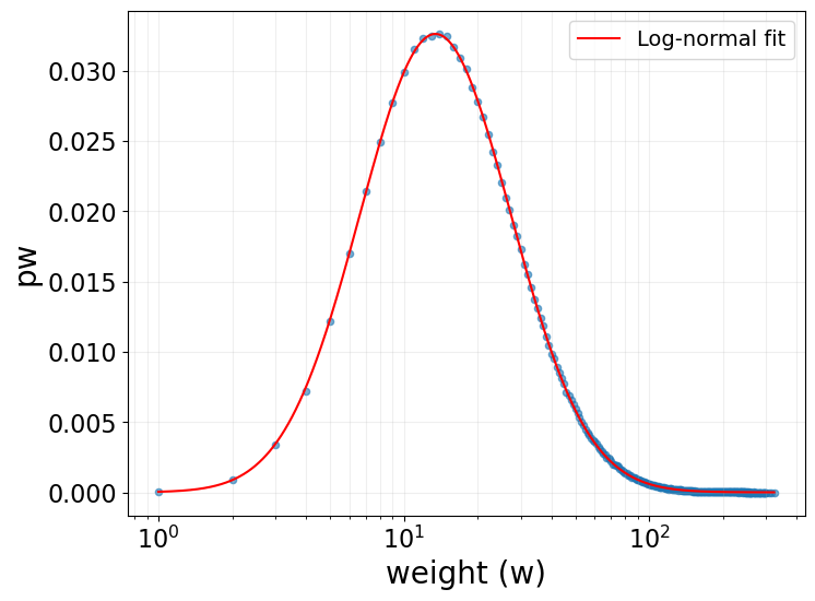
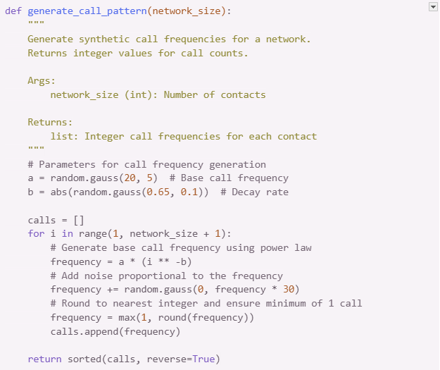
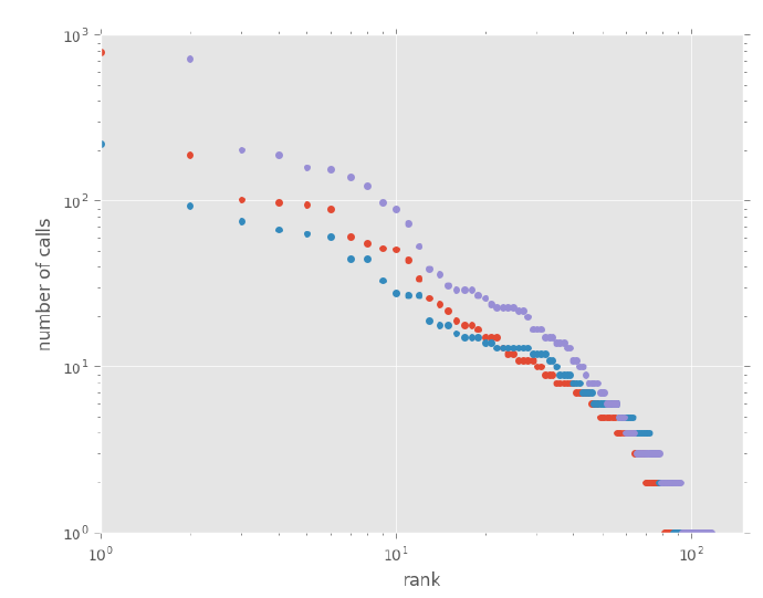
How did I pick the mean parameter values (20 for a, 0.65 for b)? I tweaked them until the synthetic call patterns generated by my code visually resembled the example plots of real call data shared by Pádraig MacCarron [cite: 294, Image 3], as shown in the comparison plots below. This ensured the synthetic data had a plausible shape before applying the clustering analysis.
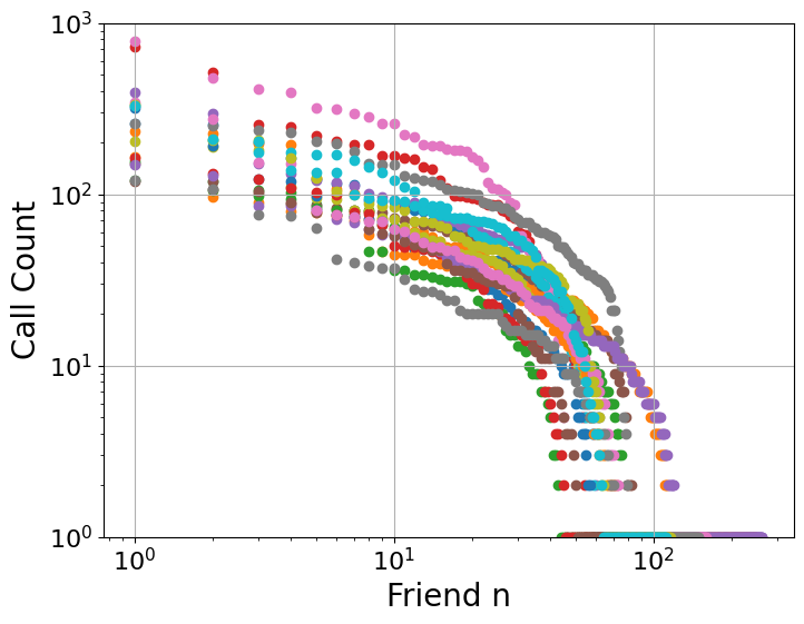
After generating this synthetic data, I applied the same Jenks natural breaks clustering algorithm to it, just as the original paper had done, to see if similar layer structures would emerge. I found that the optimal number of clusters closely matched the original paper's results (their Figure 3). In my synthetic data, most networks were optimally divided into 4 or 5 clusters:

My replication showing the distribution of optimal number of clusters. Note that the majority of networks have 4-5 clusters, just as in the original paper's Figure 3.
While my replication isn't a perfect match (which might be due to differences in the underlying raw data), the key pattern is clearly reproduced: the majority of networks are optimally divided into 4 or 5 clusters according to the Jenks natural breaks algorithm with a goodness-of-fit threshold of 0.85.
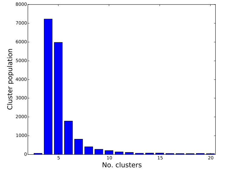
With these optimal cluster numbers identified, I then looked at the sizes of the resulting layers (corresponding to the paper's Figure 4 and Table 1):
The Surprising Results
The results were striking. Despite containing no inherent layer structure, my synthetic data yielded clustering patterns and layer sizes nearly identical to the real phone data. As the table below shows for both 4- and 5-cluster solutions, the similarity is remarkable, strongly suggesting the 'layers' found in the original study could be artifacts of applying clustering to continuous data, rather than evidence of discrete social structures.
Not only did I reproduce the layer sizes, but my approach also reproduced other key findings. Just as in the original paper, the distribution of contacts within each layer followed log-normal distributions.
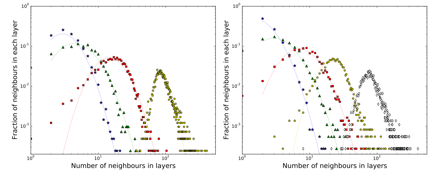

My replication of the paper's Figure 4, showing the distribution of the number of contacts in each layer for networks with 4 clusters (left) and 5 clusters (right). Note the log-normal distribution of each layer, closely matching the original paper's findings.
The fact that both the layer sizes and their internal distributions could be replicated so closely using a simple, continuous model deliberately lacking discrete layers strongly suggests the structures identified in the original paper are mathematical artifacts of the clustering method applied to noisy, skewed data, rather than evidence of genuine social organisation.
The Case of Figure 2: A Mathematical Artifact
It's worth examining another aspect of the original paper: Figure 2, which shows peaks in the normalised call frequency distribution that could be interpreted as evidence for natural clustering.
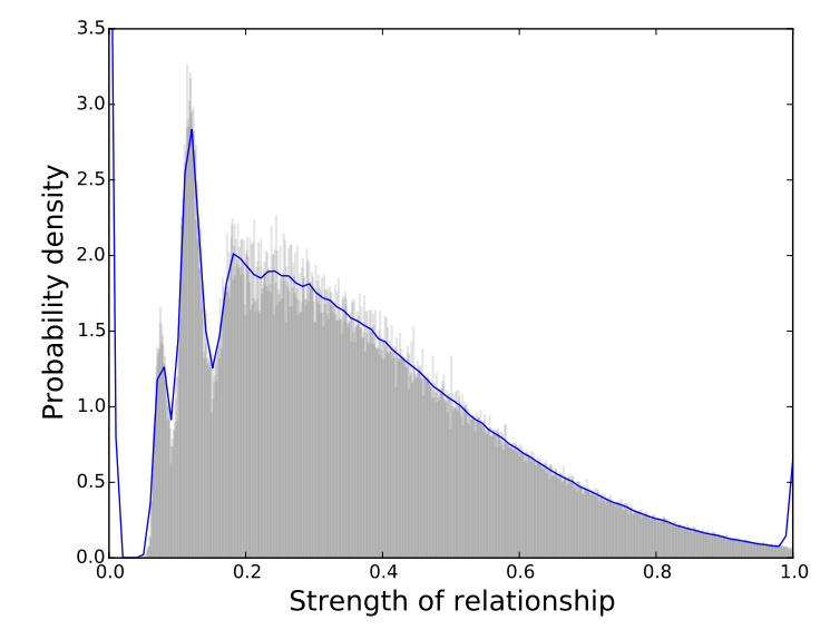

My replication of the paper's Figure 2, showing the histogram and kernel density estimate of normalized relationship strengths.
At first glance, this figure seems to provide compelling visual evidence for discrete layers in social relationships - the peaks might be interpreted as representing different relationship categories. However, I found that these peaks are actually mathematical artifacts resulting from the data processing rather than evidence of real structure.
The peaks emerge from two mathematical operations:
Taking logarithms of discrete values: When the original paper takes the logarithm of call frequencies (which are discrete integers like 1, 2, 3, etc.), it creates regular gaps in the data. This is visible in the raw distribution before normalization.
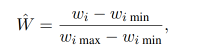
Normalization: When these values are then normalized according to the formula in the paper, the peaks get smoothed out somewhat but remain visible in the final distribution.
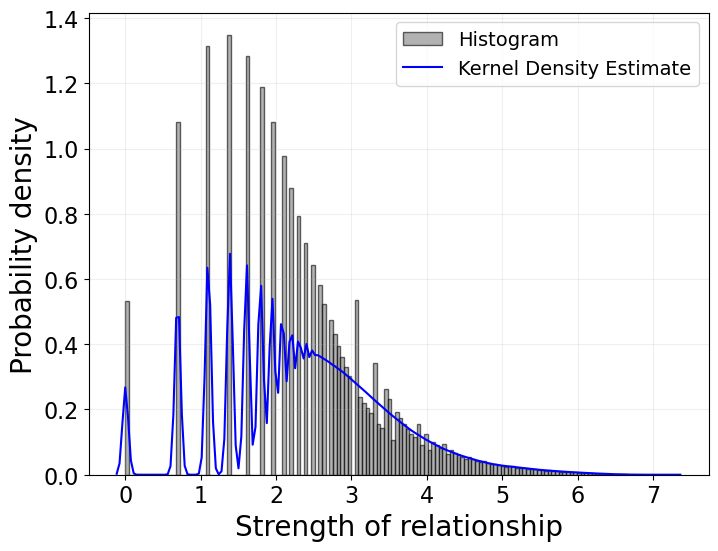
The distribution of log-transformed call counts before normalization, showing distinct peaks at log(1), log(2), log(3), etc.
This provides further evidence that the call data shows no layered structure and that all the results in this paper can be replicated with synthetic data devoid of layered structure.
What This Means
This experiment suggests that the "layers" identified in the original paper might not represent meaningful social structures at all. Instead, they could simply be a consequence of applying clustering algorithms to skewed, noisy data that follows a power law distribution. When we force a clustering algorithm to divide a continuous distribution into discrete groups, it will find "natural" break points - even when no true breaks exist.
This doesn't mean that people don't have different levels of friendship or that all social connections are equal. It simply means that the evidence for discrete, universal layers of specific sizes is much weaker than the paper suggests.
The wide variation in individual layer sizes (as shown by the log-normal distributions) further undermines the idea of consistent social layers across individuals. If these layers were truly universal cognitive structures, we might expect less variation in their sizes.
Conversations with an Author
Chuffed by my findings, I reached out to Pádraig MacCarron, one of the paper's authors. To his credit, he engaged thoughtfully with my critique and shared some interesting perspectives during our email exchange.
Regarding Figure 2 in the paper – the one showing peaks in call frequencies suggesting discrete layers – he candidly acknowledged potential issues. He noted that this figure might not be robust, mentioning that similar patterns could be generated with random data, and shared some interesting background on its inclusion in the final paper.
We also discussed the broader question of whether clustering methods would inevitably find 'layers' when applied to skewed data like call patterns. He raised a fair counterpoint: perhaps the skewed distribution of communication effort results from the existence of underlying cognitive layers, rather than the layers being an artifact of the distribution.
Furthermore, he expressed a more nuanced personal view on the strictness of Dunbar's layers than the original paper might imply. While acknowledging that we obviously structure our relationships somehow, he conveyed uncertainty about whether everyone fits neatly into 4 or 5 layers, suggesting there's likely more individual variety and subtlety than the model accounts for.
Broader Lessons
This investigation offers several valuable lessons about data analysis and interpretation:
The importance of null models: Before concluding that a pattern is meaningful, we should check whether it could emerge from a simpler model with no inherent structure.
Clustering algorithms always cluster: Just because a clustering algorithm divides data into groups doesn't mean those groups represent real-world categories.
Mathematical artifacts can masquerade as insights: Techniques like taking logarithms of discrete values or normalizing skewed distributions can create apparent patterns that don't reflect underlying reality.
Beware of confirmation bias: When researchers are looking for evidence of a particular theory (like Dunbar's layers), they may unintentionally interpret ambiguous findings as support.
Conclusion
Does this mean Dunbar's layers don't exist? Not necessarily. It simply means that this particular study doesn't provide convincing evidence for their existence. The apparent layers found in the mobile phone data can be fully explained as an artifact of applying clustering algorithms to continuous, power-law distributed data.
Our social networks may indeed have some kind of structure beyond a simple continuous gradient of closeness, but detecting such structure would require methods that can distinguish it from mathematical artifacts.
Future research might explore whether there are qualitative differences in how people interact with contacts in different "layers," or whether important life events cause reorganization within these apparent groupings. Such approaches might reveal whether these numerical clusters represent psychologically meaningful categories or are simply convenient divisions of a continuous spectrum.
All code and data used for this analysis are available on my GitHub repository [link].